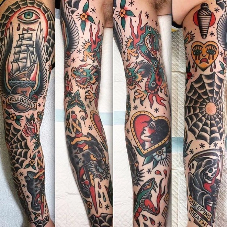

Fine line is a drawing style before it is anything else. The design is made of thin, even lines, with little or no heavy black fill, so it reads more like a pen or pencil sketch than a bold traditional piece. This guide covers what defines the style, which subjects suit it, and how to choose size, placement and composition before you talk to an artist.
What makes a design "fine line"
Three things set fine line apart from other styles:
- Line weight. Lines stay thin and consistent. Bold outlines, if any, are kept to a minimum.
- Negative space. Skin left untouched is part of the design. Open space between petals, letters or shapes keeps the piece light.
- Restrained shading. Depth comes from line density, stippling or soft grey wash rather than solid black.
Fine line is often mixed with other styles. In the Tatspark gallery you will see it combined with watercolor, dotwork, black and grey and script.
Subjects that suit fine line
Some subjects play to the style's strengths:
- Florals. Stems, petals and leaves are naturally linear. Many of the fine line designs in our gallery are florals. See fine line floral designs.
- Script and quotes. Thin lettering suits short words or a single line of text. See fine line script designs.
- Birds and small animals. Hummingbirds, cardinals and turtles work well as single subjects with open space around them.
- Symbols and celestial motifs. Moons, suns, stars and simple geometric shapes are easy to read in thin line.
- Patchwork sets. Several small fine line pieces grouped on one arm can grow over time. See patchwork designs.
Subjects that depend on large areas of solid black or strong contrast, such as heavy tribal patterns, are usually better served by blackwork or traditional styles.
Choosing size and level of detail
Fine detail needs room. A design that looks crisp as a drawing on screen can become crowded when it is scaled down to a few centimetres.
When you compare references:
- Look at the spacing, not only the subject. Designs with clear gaps between lines tend to stay readable. Dense clusters of tiny lines rely on very small spacing.
- Print it at the real size. Print or draw the design at the size you have in mind and hold it against the placement. If you cannot read the details at arm's length, the design probably needs to be larger or simpler.
- Simplify before you shrink. If the spot is small, remove elements rather than shrinking everything. One flower reads better than a full bouquet in a tight space.
- Ask the artist about the long term. Artists can tell you how they would adjust line spacing and detail for the size you want and how the piece is likely to age.
Placement and composition
Fine line designs look best when they follow the shape of the body rather than sitting on it like a sticker.
- Forearm. A long, fairly flat surface that suits vertical stems, vines and short script. See forearm designs.
- Upper arm and shoulder. Florals can curve around the arm or spill from the shoulder onto the upper arm.
- Rib and back. Long, flowing compositions follow the line of the ribs or spine.
- Hand and fingers. Small, simple motifs. Keep detail to a minimum here.
A few composition habits help:
- Point stems, vines and text along the length of the limb.
- Let one element lead (a single flower, a bird, a word) and keep supporting details smaller.
- Leave breathing room at the edges so the design does not feel cut off by the placement.
- If you plan to add more pieces later, decide the overall direction now so new pieces can join the first one cleanly.
Mixing fine line with other styles
Pairing fine line with another technique can add colour or depth while keeping the light feel:
- Fine line and watercolor. Thin outlines with soft colour washes, common on floral pieces.
- Fine line and dotwork. Stippled shading gives depth to suns, moons and space scenes.
- Fine line and black and grey. Soft grey shading adds realism to flowers and portraits.
- Fine line and script. A word or short quote placed beside a floral or symbol.
Browse these combinations with the style filters on the tattoo ideas page.
A short checklist before your consultation
- Save three to five reference designs you like and note what you like about each one: the subject, the line style or the composition.
- Decide on placement and an approximate size.
- Check whether the design fits that space at real size.
- Bring your references to a licensed tattoo artist and ask how they would adapt the design for your skin and placement.
About this guide
This is editorial design guidance to help you compare tattoo ideas. It is not medical advice. For questions about skin, aftercare or health, talk to a licensed tattoo artist or a medical professional.